
...
728x90
반응형
레이아웃 실전 _ 슬라이드 유형
이번에는 웹페이지에 들어갈 텍스트 유형의 레이아웃을 만들어 보겠습니다.
텍스트유형 디자인하기
구상한 디자인 기반으로 코딩
HTML 작성하기
<!DOCTYPE html>
<html lang="ko">
<head>
<meta charset="UTF-8">
<meta http-equiv="X-UA-Compatible" content="IE=edge">
<meta name="viewport" content="width=device-width, initial-scale=1.0">
<title>텍스트 유형01</title>
<link href="https://webfontworld.github.io/NexonLv1Gothic/NexonLv1Gothic.css" rel="stylesheet">
</head>
<body>
<section class="text__wrap section center nexon">
<div class="container">
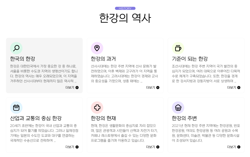
<span class="section__small">HISTORY</span>
<h2 class="section__h2 mb70">한강의 역사</h2>
<div class="text__inner">
<div class="text t1">
<h3 class="text__title">한국의 한강</h3>
<p class="text__desc">한강은 대한민국에서 가장 중요한 강 중 하나로, 서울을 비롯한 수도권 지역의 생명선이기도 합니다. 한강의 역사는 매우 오래되었으며, 이 지역을 거주하던 선사시대부터 현재까지 ...</p>
<a class="text__btn" href="#">더보기</a>
</div>
<div class="text t2">
<h3 class="text__title">한강의 과거</h3>
<p class="text__desc">선사시대에는 한강 주변 지역에 선사 문화가 발전하였으며, 이후 백제와 고구려가 이 지역을 통제하였습니다. 고려시대에는 한강이 경제와 군사의 중요성을 가졌으며, 성종 때에는 ...</p>
<a class="text__btn" href="#">더보기</a>
</div>
<div class="text t3">
<h3 class="text__title">기준이 되는 한강</h3>
<p class="text__desc">조선시대에는 한강 주변 지역이 국가 발전의 중심지가 되었으며, 여러 대목으로 이루어진 다목적 수로 체계가 구축되었습니다. 또한, 한강을 경계로 한 강서지방과 강동지방이 서로 ...</p>
<a class="text__btn" href="#">더보기</a>
</div>
<div class="text t4">
<h3 class="text__title">한강의 과거</h3>
<p class="text__desc">20세기 초반에는 한강이 국내 산업과 교통의 중심지가 되어 활기를 띄었습니다. 그러나 일제강점기에는 일본의 수도인 도쿄와 대구를 연결하는 국제적인 수송선으로 전락하여 ...</p>
<a class="text__btn" href="#">더보기</a>
</div>
<div class="text t5">
<h3 class="text__title">한강의 과거</h3>
<p class="text__desc">현재, 한강은 생활문화의 중심지로 자리 잡았으며, 많은 관광객과 시민들이 산책과 자전거 타기, 카페나 레스토랑에서 즐길 수 있는 다양한 문화 프로그램을 즐기며 이용하고 ...</p>
<a class="text__btn" href="#">더보기</a>
</div>
<div class="text t6">
<h3 class="text__title">한강의 과거</h3>
<p class="text__desc">2021년 현재 한강 주변 지역에는 한강공원, 반포한강공원, 여의도 한강공원 등 여러 공원과 수목원, 문화센터, 미술관, 박물관 등 다양한 문화시설이 조성되어 있습니다.</p>
<a class="text__btn" href="#">더보기</a>
</div>
</div>
</div>
</section>
</body>
</html>HTML 정리해보기
- 텍스트 유형의 경우 하나의 컨테이너를 만들어 작은 마크와 주제를 적어주고 텍스트들을 넣을 수 있는 text__inner 상자를 하나 만들었습니다.
- text__inner의 상자에는 다시 주제를 나타내는 h3태그와 설명란의 p태그 설명을 길게 늘려서 볼 수 있는 더보기를 a태그로 만들어 주었습니다.
CSS 작성하기
* {
    margin: 0;
    padding: 0;
}
a {
    text-decoration: none;
    color: #000;
}
h1,h2,h3,h4,h5,h6 {
    font-weight: normal;
}
img {
    vertical-align: top;
    width: 100%;
}
.mt10 {margin-top: 10px !important;}
.mt20 {margin-top: 20px !important;}
.mt30 {margin-top: 30px !important;}
.mt40 {margin-top: 40px !important;}
.mt50 {margin-top: 50px !important;}
.mt60 {margin-top: 60px !important;}
.mt70 {margin-top: 70px !important;}

.mb10 {margin-bottom: 10px !important;}
.mb20 {margin-bottom: 20px !important;}
.mb30 {margin-bottom: 30px !important;}
.mb40 {margin-bottom: 40px !important;}
.mb50 {margin-bottom: 50px !important;}
.mb60 {margin-bottom: 60px !important;}
.mb70 {margin-bottom: 70px !important;}


.container {
    width: 1160px;
    margin: 0 auto;
    padding: 0 20px;
    /* background-color: rgba(0, 0, 0, 0.1); */
}
.nexon {
    font-family: 'NexonLv1Gothic';
    font-weight: 400;
}
.section {
    padding: 120px 0;
}
.center {
    text-align: center;
}
.section__small {
    font-size: 14px;
    border-radius: 50px;
    padding: 1px 23px;
    background-color: #8179e1;
    color: #fff;
    text-transform: uppercase;
    display: inline-block;
    margin-bottom: 20px;
}
.section__h2 {
    font-size: 50px;
    font-weight: 400;
    margin-bottom: 30px;
    line-height: 1;
}
.section__desc {
    font-size: 22px;
    line-height: 25px;
    color: #666666;
    margin-bottom: 70px;
    font-weight: 300;
    line-height: 1.5;
}
/* text__wrap */
.text__inner {
    text-align: left;
    display: flex;
    flex-wrap: wrap;
    justify-content: space-between;
}
.text__inner .text {
    width: 32.3333%;
    border: 1px solid #f5f5f5;
    border-radius: 10px;
    padding: 90px 20px 20px 20px;
    box-sizing: border-box;
    margin-bottom: 20px;
    transition: all 0.3s;
    cursor: pointer;
    position: relative;
}
.text__inner .text:hover {
    background-color: #f5f5f5;
}
.text__title {
    font-size: 24px;
    margin-bottom: 10px;
}
.text__desc {
    font-size: 16px;
    color: #666;
    margin-bottom: 15px;
    line-height: 1.5;
}
.text__inner .text::before {
    content: '';
    width: 60px;
    height: 60px;
    background-color: #9ff98b;
    background-image: url(../asset/img/textType01_01.svg);
    background-repeat: no-repeat;
    background-position: center;
    position: absolute;
    left: 20px;
    top: 20px;
    border-radius: 50%;
}
.text__inner .text.t1::before {
    background-color: rgba(107, 255, 184, 0.2);;
    background-image: url(../asset/img/textType01_01.svg);
}
.text__inner .text.t2::before {
    background-color: rgba(208, 107, 255, 0.2);;
    background-image: url(../asset/img/textType01_02.svg);
}
.text__inner .text.t3::before {
    background-color: rgba(208, 255, 107, 0.2);;
    background-image: url(../asset/img/textType01_03.svg);
}
.text__inner .text.t4::before {
    background-color: rgba(107, 202, 255, 0.2);;
    background-image: url(../asset/img/textType01_04.svg);
}
.text__inner .text.t5::before {
    background-color: rgba(255, 107, 107, 0.2);;
    background-image: url(../asset/img/textType01_05.svg);
}
.text__inner .text.t6::before {
    background-color: rgba(137, 107, 255, 0.2);;
    background-image: url(../asset/img/textType01_06.svg);
}
.text__btn {
   	float: right;
   	position: relative;
	padding-right: 20px;
}
.text__btn::before {
    content: '';
    position: absolute;
    right: 0;
    top: 0;
    width: 15px;
    height: 15px;
    background-image: url(../asset/img/icon_plus.svg);
    transition: all 0.3s;
}
.text__btn:hover::before {
    transform: rotate(360deg);
}
CSS 정리해보기
- 텍스트 유형도 다른 유형과 마찬가지로 위으 리셋값은 동일합니다.
- text__inner에 display: flex 속성을 주어 6개의 텍스트 상자를 배치하였습니다.
- 각각의 text 상자에 마우스 오버 효과를 주어 클릭하는 느낌을 주었습니다.
- text 상자에 가상요소를 만들어 background-image로 아이콘을 만들어 넣어주었습니다.
- text__btn (더보기)에도 가상요소를 사용해 아이콘을 하나 넣어주고 마우스 오버효과로 360도 돌아가게끔 만들어 주었습니다.
이상으로 텍스트 유형의 레이아웃을 만들어 보았습니다 !
728x90
반응형