
...
728x90
반응형
레이아웃 실전 _ 배너 유형
이번에는 웹페이지 안에 들어가는 배너유형을 작업해 보도록 하겠습니다.
배너유형 디자인하기
HTML 작성하기
<!DOCTYPE html>
<html lang="ko">
<head>
<meta charset="UTF-8">
<meta http-equiv="X-UA-Compatible" content="IE=edge">
<meta name="viewport" content="width=device-width, initial-scale=1.0">
<title>배너 유형01</title>
<link href="https://webfontworld.github.io/NexonLv1Gothic/NexonLv1Gothic.css" rel="stylesheet">
</head>
<body>
<section class="banner__wrap section center nexon">
<article class="banner__inner">
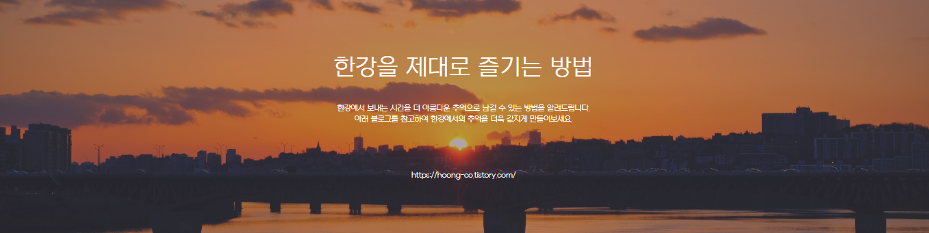
<h3>한강을 제대로 즐기는 방법</h3>
<p>한강에서 보내는 시간을 더 아름다운 추억으로 남길 수 있는 방법을 알려드립니다.<br>
아래 블로그를 참고하여 한강에서의 추억을 더욱 값지게 만들어보세요.</p>
<a href="#">https://hoong-co.tistory.com/</a>
</article>
</section>
</body>
</html>HTML 정리해보기
- 이번 배너 유형은 다른 section들과 달리 하나의 article만 만들었습니다.
- 하나의 article에 h3, p, a 태그를 사용하였습니다.
CSS 작성하기
* {
    margin: 0;
    padding: 0;
}
a {
    text-decoration: none;
    color: #000;
}
h1,h2,h3,h4,h5,h6 {
    font-weight: normal;
}
img {
    vertical-align: top;
    width: 100%;
}
.blind {
    position: absolute;
    clip: rect(0 0 0 0);
    width: 1px;
    height: 1px;
    margin: -1px;
    overflow: hidden;
}

.mt10 {margin-top: 10px !important;}
.mt20 {margin-top: 20px !important;}
.mt30 {margin-top: 30px !important;}
.mt40 {margin-top: 40px !important;}
.mt50 {margin-top: 50px !important;}
.mt60 {margin-top: 60px !important;}
.mt70 {margin-top: 70px !important;}

.mb10 {margin-bottom: 10px !important;}
.mb20 {margin-bottom: 20px !important;}
.mb30 {margin-bottom: 30px !important;}
.mb40 {margin-bottom: 40px !important;}
.mb50 {margin-bottom: 50px !important;}
.mb60 {margin-bottom: 60px !important;}
.mb70 {margin-bottom: 70px !important;}


.container {
    width: 1160px;
    margin: 0 auto;
    padding: 0 20px;
    /* background-color: rgba(0, 0, 0, 0.1); */
}
.nexon {
    font-family: 'NexonLv1Gothic';
    font-weight: 400;
}
.section {
    padding: 120px 0;
}
.center {
    text-align: center;
}
/* banner__wrap */
.banner__wrap {
    background-image: url(../asset/img/bannerType01.jpg);
    background-size: cover;
    background-position: center;
    background-repeat: no-repeat;
}
.banner__inner {
    color: #fff;
}
.banner__inner h3 {
    font-size: 50px;
    margin-bottom: 50px;
}
.banner__inner p {
    margin-bottom: 100px;
    line-height: 1.5;
}
.banner__inner a {
    color: #fff;
}
CSS 정리해보기
- 마찬가지로 위의 기본 속성들은 변함이 없고 banner__wrap부분 부터 만들어 주었습니다.
- width값 100%로 배경이미지가 들어가야하기 때문에 banner__wrap의 width값을 설정하지 않고 background-image로 넣어주었습니다.
- background의 속성으로는 size: cover; / position: center; / repeat: no-repeat; 를 주었습니다.
이상으로 배너유형의 레이아웃을 만들어 보았습니다 !
728x90
반응형